My Work in Progress
11/24/2005
11/13/2005
Dallas Animation: a work in progress

An excellent speaker - if you ever have the opportunity to see him, please do! While Vince from ABOSG did ask what Brad Bird's next project was (and what he was working on currently), Bird refused to chat about that, although he did talk about his previous projects...Iron Giant, The Incredibles, his early work at Disney and his mentor, Milt Kahl. Fun stuff! And, yes, all very inspirational.
When I first started to try and gain some animation experience at school in the late eighties, there was no place here in Dallas where I could either learn the skills or find a mentor. Now, there are game art and development curriculums, technical schools focused on teaching Maya or 3D Studio Max or whatever is the most popular 3D program of the moment, and even BFA's offered in computer animation. These days the DFW area has various studios that do commercial animation, post-production, game development, game cinematics and feature animation. Some are focused in one area, others are doing whatever it takes to stay in business. It's all good. And it's really exciting to finally see growth and exciting prospects for the animation industry in Dallas, Texas.
11/12/2005
It's that time of year
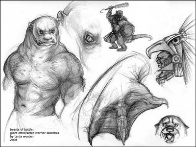
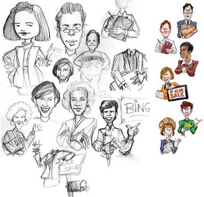
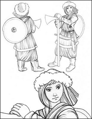
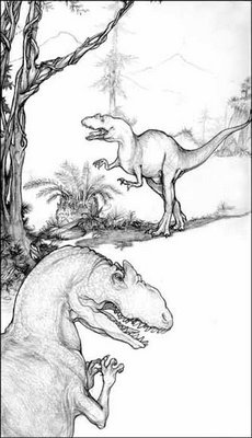
So, here are a few old projects that show a bit of my thought process...from when I get the brief or art request document and start doodling rough sketches, to a final concept.
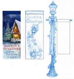
This one is part of a series of banners I created for Christmas decor using my Photoshop paintings:
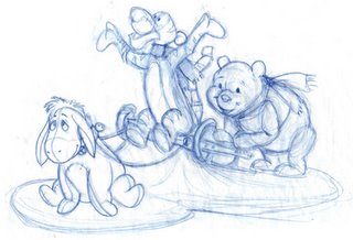
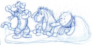
Here are some rough sketches that I did of some ideas I had for a couple of table-top animated plush scenes with Pooh and friends (Licensed art being a sub-category for every season...yup, I do alot of Disney product art requests):
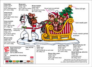
And here's a color version of a table-top animated plush with callouts that never made it to sample production even. Basically, what that means is - for all that there's an art request made, it doesn't mean that the concept actually gets through all of the checks and balances and art reviews and products reviews to becoming a sample series made that we can put in our showrooms and sell to our buyers.
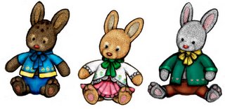
Here is another set of little animated plush bunnies I designed for Easter that never got made into samples or got approved for factory production. I had so much fun picking out materials that were soft to the touch to help make them sweet and huggable. Oh, well.
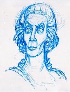
And then, for contrast, there's always something for Halloween that pops up:
11/06/2005
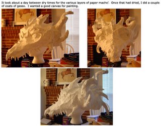
Making the Dragon Mask
Here chick, chick, chick...
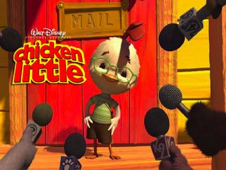
Hmm...what to say. I liked it. Did I love it? Nope.
The audience really seemed to enjoy it, especially the little kids and all the grandparents that seemed to be around for this particular afternoon showing. I would say that there were more laughs over the bits of comedy in this one than there were for Madagascar, if I had to use a comparison to a recent animated feature. I haven't seen the special 3D version of Chicken Little, but I'd like to try that in the next couple of weeks, once the NASCAR event is finished with so I won't be sitting in traffic for a couple of hours (the theater that's playing the 3D viewing version is over in that direction). After reading a variety of negative commentary about the movie (like this article from a year ago), I'm curious if some of it is in part or because of the changes that are going on with the management of Walt Disney and the Pixar distribution deal.
***SPOILER ALERT***
Here's what I LIKED:
- the friendship and camaraderie between the main characters, Chicken Little, Ugly Duckling, Runt of the Litter, and Fish Out of Water
- Kirby, the little alien fuzzy kid (soft hair, cute, big eyes...3, in fact...what's not to like? Great toy potential! ha. However, the samples I've seen sucked - I know they could've done a much better job)
- the customized houses that matched the families that lived there (chicken coop for Chicken Little and his Dad for example)
- the energetic twitching (puff, puff, puff) that most of the cars seemed to have as they were driving along
- Fish Out of Water (so simple, so right!)
- Buck Cluck's eyebrows (fascinated me...I couldn't stop watching them when he was on screen)
- the panic "attack" by the aliens because of a missing child (but nobody died...or DID they...)
- the flash cards. heh
- it wasn't a musical. YAY!!!
- the scene where Chicken Little is sitting outside the principal's office listening to his father and the principal discuss his behavior (I loved the lighting and layout for this particular scene. The silhouettes of the two adults also really held my attention. Nice.)
- the overall design and layout of some of the scenes. nicely done. I especially liked how they did close-ups of some of the characters (something I'll have to look and mention the specifics when I see it again, in 3D-vision)
- the errors of technology. heh
Here's what I DIDN'T LIKE:
- it's another father/son buddy story
(please...something more original. what's wrong with having a mom? that's alive? or both parents even? things could still go wrong, you know! and why do practically all the "girl" stories have to be fairy tales about princesses who find "True Luv"? ARGH! ok, I won't go there)
- parent doesn't believe child (ever. until parent's nose is rubbed in evidence and he sees aliens)
- child doesn't listen to adults (coach, father) because child knows better (whatever - there are other more positive ways to show how a child's curiousity or experience can give them a different opinion of how their goals can be reached)
- the pop references (one or two is ok and kinda funny, but when it's three or more it gets tedious and turns into a Dreamworks story prop. yes, those movies made some money...but that doesn't make them classics or even a good story. I love a good story.)
- the romance between Chicken Little and Ugly Duckling (that was just totally lame and didn't suit either the age of the characters or the target audience)
- the pacing (as I'm learning more about story development in my ongoing studies, I'm gaining a better appreciation of a good story and story pacing...and how much it can all go bleh when it's just not well-written)
- Chicken Little's eyes (weird, I know, but the lack of a pupil disturbed me, especially since his father's eyes and all the other characters had the obvious iris and pupil; and they even seemed occasionally cloudy although that may have been because of the glasses)
- all that texture stretching during movement and the plastic clothes; as "real" as they seemed to go with the overall design, that stretching seemed out of place (Pixar's Toy Story does a much better job in the texture and rigging department and that was created a while ago...and besides those were toys)
- The floating walk/slide that Chicken Little had in a couple of shots (tsk, tsk, that's a basic character animation skill)
Eh, that's enough with the negativity. After all, I did actually like the movie... I'll remember the others when I buy the DVD and watch it again. ;)
I'm really curious to find out what were some of the other story lines the director and producer, Mark Dindal and Randy Fullmer (the ones that previously crafted "the Emperor's New Groove") threw away before settling on this particular version. I wonder if any of those ideas would have crafted a stronger story than what was finally shown in theaters this weekend.


