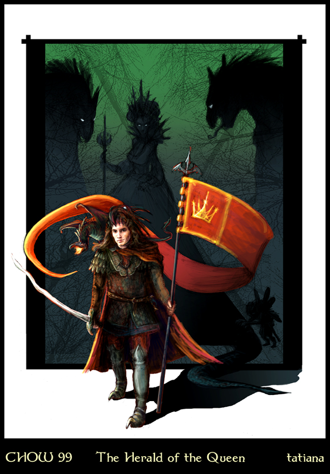
So, this is the final version that I submitted. A fun little project that I enjoyed participating in even so it was mostly last minute crunching (I was sick most of Saturday, bleh, so no artwork), especially since it stretched my skills a bit and forced me to make painting decisions rather quickly in order to meet the Sunday midnight deadline last night. While I wasn't able to include everything that I wanted to, I'm pretty happy with what I ended up with; and the best part, I can continue working on it so that it's a bit closer to the vision in my head, and finish the bits I had to leave out. Yay!
I really enjoyed the research for this particular project, too -- from learning about heraldry and all the rules (I ran out of time to fully include the design idea in my banner), to learning about various types of armour and associated weaponry....to finding reference photos online of what I think is an attractive man (part of the extra criteria I mentioned before, heh). Yup, that part was particularly difficult....so many interesting choices. :)
Anyways, here are some of the progress shots from the initial revised thumbnail layout I mentioned previously to the final color that I posted in the CHOW 99 thread.
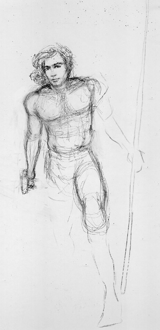
Progress 02: Working on the detailed pencil
(hot press illustration board, 2H pencil)
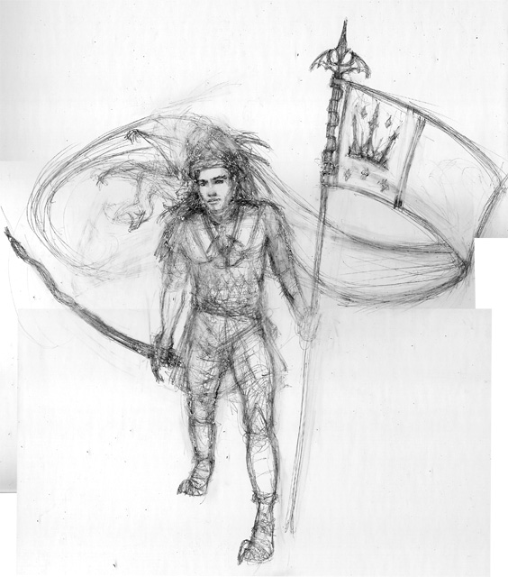 I initially was planning on doing two illustration boards with the Herald on one board and the background scene of the Queen and her entourage and the gateway (the black frame -- gateway art wasn't completed to meet the deadline), but time was running out so I ended up doing less detailing for the underdrawing and planned on painting it all instead...depending, of course, on how much time I had left at the end. The Herald, though, being the main subject of the piece needed to be detailed and finished even if I couldn't get to the background.
(hot press illustration board, 2H pencil)
 I initially was planning on doing two illustration boards with the Herald on one board and the background scene of the Queen and her entourage and the gateway (the black frame -- gateway art wasn't completed to meet the deadline), but time was running out so I ended up doing less detailing for the underdrawing and planned on painting it all instead...depending, of course, on how much time I had left at the end. The Herald, though, being the main subject of the piece needed to be detailed and finished even if I couldn't get to the background.
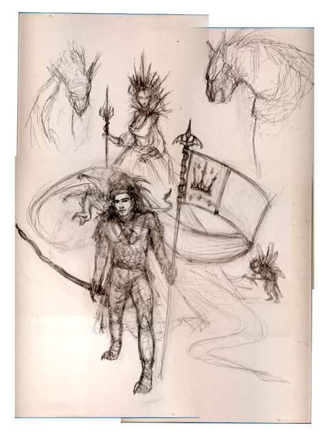
Progress 03: Final detailed pencil
Scanned in sections and composited in Photoshop at 240dpi, approx. 10"x14". The final detailed underdrawing took about 4 hours time and included pulling references (armour, etc.).
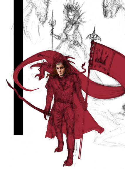
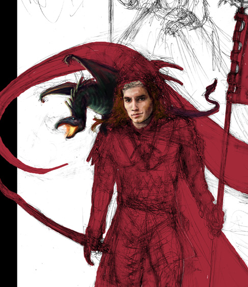
Progress 04: Color decisions and blocking in elements
(elements are on various layers):
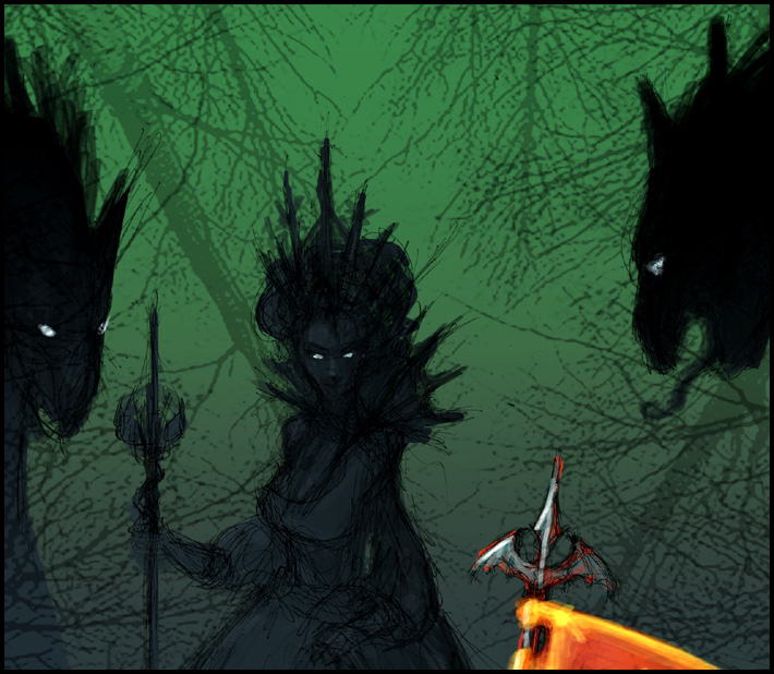
 I wanted the Herald to pop from the background and I was already planning on him being warm red with layers of color over that so that's what I blocked first. I also wanted the background to be green (think forest) with cool blue undertones to provide some nice secondary lighting as well as be a nice compliment to the Herald...and with the right mix of colors the overall color choices would help maintain the fantasy look that I was going for.
Scanned in sections and composited in Photoshop at 240dpi, approx. 10"x14". The final detailed underdrawing took about 4 hours time and included pulling references (armour, etc.).

Progress 04: Color decisions and blocking in elements
(elements are on various layers):
 I wanted the Herald to pop from the background and I was already planning on him being warm red with layers of color over that so that's what I blocked first. I also wanted the background to be green (think forest) with cool blue undertones to provide some nice secondary lighting as well as be a nice compliment to the Herald...and with the right mix of colors the overall color choices would help maintain the fantasy look that I was going for.
Progress 05: Focusing on painting Herald
(the handsome face - most important!):
 I wanted a rather detailed face for my herald, since I was trying to create an interesting and attractive character (at least, to me). So that was my initial focus. Once that was finished I planned on working broader rather than one small area at a time.
(the handsome face - most important!):
 I wanted a rather detailed face for my herald, since I was trying to create an interesting and attractive character (at least, to me). So that was my initial focus. Once that was finished I planned on working broader rather than one small area at a time.
Progress 06: Still focusing on painting Herald
(close-up of the almost finished face and his little fierce dragon announcer):
(close-up of the almost finished face and his little fierce dragon announcer):

Progress 07: Still focusing on painting Herald
(close to final paint of Herald):
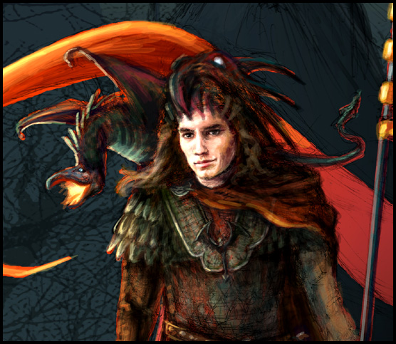
 At this point, I was seriously running out of time so I stopped creating progress JPGs and simply focused on finishing the concept. So, for my final post, here are a couple of detail shots of the submitted piece.
(close to final paint of Herald):
 At this point, I was seriously running out of time so I stopped creating progress JPGs and simply focused on finishing the concept. So, for my final post, here are a couple of detail shots of the submitted piece.
Next up: CHOW 100 - Medusa the Queen!
Whee!!!


2 comments:
Hi, and Happy New Year!
I really loved your sketches, and to see the process of your work.
Really, really nice!
Cheers from Madrid!
Hi Matias -- Happy New Year to you, too! I like your sketches as well; looking forward to seeing more of your work in the coming year. :)
Post a Comment