My Work in Progress

A sketchblog where I post a few of my scribbles from a variety of works-in-progress, usually from my rather random personal creativity outside of the daily grind. I occasionally, but not always, post the final artwork.

8/28/2005

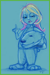
Don't Toy With Me

Doing alot of thinking again. Of this and that.

But I also took some time today to do a bit of reading. I love spending hours reading a good story. I'd rather read a good book than go watch a movie. I miss having the time to disappear in some new world that only exists in my imagination. Better than dreaming sometimes. My family sometimes said it was like I was addicted and books were my drug because I'd spend hours reading book after book. Yeah, sometimes it was hard to stop.

But it put such lively and interesting characters in my head.

Didn't go to sketchgroup today. I don't think I've gone in the past month, sad to say. I'm trying to cut back on any extra driving until I get my car checked out. The usual maintenance thing that somehow always ends up costing me around $600+. Argh. So, no driving. Much. Save here, save there. Besides, it gives me more time to sketch and do other CG work. This weekend I brought home some work to do, too...they want me to come up with the next face for one of our animatronic characters. Evidently, my portrait skills are coming in handy, heh.

I also saw some of my Halloween bust samples in our showroom that had just come over from the China factory. Not bad! They followed my concepts really well. And I happen to know that some of our buyers really got enthusiastic about those and a few of my other projects. Sweet!
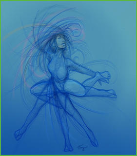
Just a bit of dancing around with my pencil tonight. No plans, just fun with the lines. I can see that I'm forgetting my realistic human anatomy...need to do some life drawing again. And get a reminder about what and where the various muscles are. Getting out of practice again. D'oh!

8/27/2005

Original Character Design?

From Cartoon Brew, I was pointed to a new (for me) artist's blog the other day, Stephen Silver, who is now a lead character designer for Sony Feature Animation. I don't know if it's because I've been checking out so many other character and visual development artists to see what they are creating, what they have in their portfolios or sketchbooks, or whatever...but it seems like they all are really starting to look alike. Every one of the successful employed character designers in the animation industry is sketching with almost the same pencil - it either looks like what I'm seeing on Silver's site and Mark Behm or Peter de Seve, or the original Mary Blair and now Ricky Nierva, Ronnie del Carmon and other stylized or "retro" designers.

Where's the originality?

Is it because they're all influencing each other that much, or maybe have the same teachers or mentors? Or is that simply the required look or design trend that is getting them work at the various studios in the animation industry? Is this the artwork that the studios see as most successful for their markets? Or...are these artists the only ones posting or publishing their artwork and I'm missing out on seeing other interesting and original character designs, concept art and other visual development art for successful feature animation?

Maybe if I compare that type of animation design artists to the artists that I currently work with.... If you print out our concepts and spread them out on one of the conference room tables - even the producers can frequently recognize which artist has done which concept because of the line quality and concept style. While we can mimic each others work when revision work is necessary, we do each have our own individual styles.

Maybe I'm just generalizing too much.... Could be that it's all that licensed artwork from Disney, Pixar, Warner Brothers, Nickelodeon, etc., etc., that I've been working with for multitudes of product design concepts at my job in the past year...in addition to doing my own original art...that has me all befuddled. For a bit of contrast to the standard character design clones I've seen, there's always the frantic artwork created by artists for various animated
Nickelodeon projects and Adult Swim; and the vector influenced designs in animations such as Kim Possible and The Fairly Oddparents. But that's 2D animation. The studios I'm interested in produce 3D feature animation. Maybe that's the explanation. That trend, those two artistic styles are the only way they can create the designs for the masses.

I'm not even looking at Anime.

I actually have been feeling the same way about concept artists in the game development industry for the last few years, too. While the game art style is in no way the same as the animation industry artists, it does seem that the majority of game artists who post their work online or that I've had the opportunity to see are creating the same design trend of monsters, "heroes", and environments. Except for
Oddworld. :) Maybe if you consider how new the game art community is and then the look and feel of most of the successful games. They all want to be the next Feng Zhu, or Doug Chiang...or maybe be the lead artist working on the next Doom or Quake or Star Wars universe. heh. Go to any CG artist forum where there is a good mix of professional and student participation and maybe you'll see and understand what I mean. It's all rather similar.

One of the reasons I've noticed this trend for both industries is because I've studied the children's book illustration market for years. I love children's picture books and have favorites in my own library from certain illustrators like
Arthur Rackham, Leo and Diane Dillon, Dr Seuss (Theodor Seuss Geisel), Jan Brett, Maurice Sendak, Mercer Meyer, Mary GrandPre and a few others. As an illustrator for children's books myself, I've had to recognize what is selling and what isn't, and how I can either develop a project in that successful style: "same but different" (this is a frequent art director request), or present my work as something unique that isn't following a trend already out there - the better to catch the eye of an art director that isn't familiar with my artwork.

It's all in the marketing....

So, when I do run across an artist who's artwork is different from what everyone else seems to be doing, stands out even when it's the same subject, has a consistent style of their own, and appeals to me in some esoteric way...I make a note of their name, bookmark their website if they have one, and download their work to study and appreciate. It's very much an outgrowth to the habit I had when I was a little tot...slowly flipping through my favorite picture books or illustrated fairy tales from the library, or checking out the children's encyclopedia set we had at home, or especially spending hours studying the watercolour prints of the
Audubon's Birds of America.

I hope one day that someone enjoys viewing my published artwork that way, too. :)

8/24/2005

Continuing Education

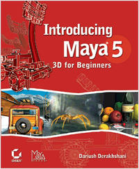
At my home studio, I've been working on keeping up my skills in 3D (yes, not giving up on that!) and working on updating my portfolio so I'll have some lovely new things to show when I finally get a call for interviews as a visual development artist for the animation industry. In addition to the Modeling book I posted the other day, I'm also studying the Alias Wavefront/Maya Press book Introducing Maya 5 - 3D for Beginners.

I've gone through most of the book before, but as little time as I've spent with 3D in general in the past year and Maya in particular, I don't mind revisiting the lessons again. I need the practice. Plus, since I have the other books in the series, it makes total sense to start with the first book which has an excellent introduction to Maya 5. I realize that Maya 8 will shortly be released. Well, until I'm actually using a 3D package at my job, there's no real reason to upgrade. I live on a tight "recent grad/starving artist" budget.

For work, I'm researching learning dvds and reference books for the new Painter software we're getting in the next few weeks. Our art department is in the process of being switched over to PC's instead of Mac computers. Not that I have anything against Macs; heck, I got a Mac when I bought my first computer in '93. But, the lack of technical support from the IT department at my job has made working with Macs a headache at times. I'll be glad when we've finally made the switch. Plus, we'll get a few new toys to play with...I mean, we'll get a few new accessories in addition to the new machines to enable us to more rapidly produce quality artwork for the company.

:))

Which means each of the concept artists will finally have a scanner of their own at their desks. And we'll be able to archive files to CD (we'll each have an internal burner) or DVD (we'll have an external burner for our group, too). Yay! And another one of those lovely additions is the latest version of Painter. I'm very excited to finally get some quality time with that software at my job. Plus, I get to help train the other artists on how to use it. Ah, I can hear the crack of my whip now...ha!


One of the reasons I love working as a CG artist is because I have to keep learning and practicing my variety of creative skills in order to be successful at my job. In whatever industry I'm working in. Keeps me on my toes.

Yes, I prefer to specialize in one aspect of my job - I'm a visual development artist. I have to be able to take the ideas that I or someone else on my team has requested, and come up with something, some concept or concepts that can express those ideas. Sometimes that's toys or novelty items (oh, my...the "novelty items" I'm working on this week...not for kids!); sometimes that's presentation boards or storyboards or character designs or graphic novels (soon, Precious....soon). And I will use whatever tool that can best help me provide the concept, the visual idea for my client to actually have someone else (factory, production artists, etc.) actually produce the product...whether it's by my using a Mac or PC, or 2D or 3D, or whatever other tool that I can use to be my canvas. Plus, as a visual development artist, the various professional experiences I've had have helped provide me with different perspectives than someone who has focused on...hmmm...ACCOUNTING for example. :)

Well, a pep talk now and then is helpful. From me, to me. I will find some way of presenting myself and my work the right way at the right time...so I can be where I want to grow.

I told my mom that I'm relocating to California.

8/22/2005

Patience

Right now it's very much hurry up and wait, for too many things.

Creatively speaking, I feel frustrated sometimes because I can't or don't know how to do the techniques I want to do in a 3D program. When I was in school, it usually was a procedure that had been covered rather quickly in class. Or, since we had a students in our classes that had a wide-range of experiences with 3D (some were total newbies while others had been working with it on their own at home for some time prior to attending school) it was sometimes assumed by my instructors that we already knew how to do something. So, if you didn't ask the question, you missed out.

Unfortunately, half the time you didn't know what questions to ask.

Part of this frustration is because I feel so comfortable with my other creative skills - drawing, painting and illustrating, and my digital work with Photoshop and Illustrator and other similar programs I've been working with for years. Funny though, I was just thinking today, how much my drawing skills are improving again. How much better I've gotten (once again) with being able to take the vision in my head and putting it on paper. Or just starting out with some kind of nibble of an idea and developing it as I go, whether for work or my own personal projects, and liking the results I get. How much more I like my home studio Wacom tablet since I have to use one every day at work.

It's all a matter of practice and familiarity. Practice, practice, practice. And the patience to see it through.

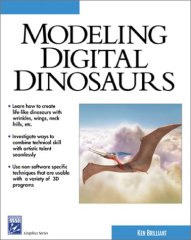
So, this week, I'm getting back in gear at last with my 3D projects. Project number 1 is to model and texture a Wyvern. After looking through my modeling books, I figured I'd do something I've always wanted to do: model a dinosaur. Just like everyone else. heh. Well, not exactly. A wyvern is more like a dragon, but not really. Anyways, I've been remembering this one scene from the old
Jonny Quest episode about a creature, Turu, that turned out to be some sort of Pteranodon. Made me think about how I could do something like that, but different. I decided to use a tutorial for modeling a Pterodactyl that's in one of my books that is non-software specific. Makes it easier to understand the overall 3D technique rather than having to rely on a specific 3D program.

For this project and the next, I'm planning on working with Max software. I have Max 5 already installed, but before I finished school I bought the Max 6 upgrade so I may go ahead and get that one on my machine. It was supposed to have an improved render capability as well as some other additional features. I need to be sure though before I install it that all the plug-ins I have will still work. If not, then I'll hold off. I like the plug-ins. :)

Here's the book I'll be working from. I'll post my sketches and turnarounds of the wyvern that I plan to model in the next couple of days. Similar enough to the dinosaur tutorial so I can follow that along, but more the kind of stuff that I like to do and won't mind having in my portfolio.

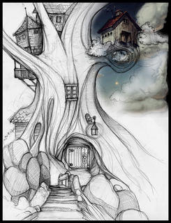
My 2nd 3D project is more of a botany or environment project. I'll be using a tutorial on space plants to help me model and texture a living tree-house that I sketched in my last quarter of school (Spring 2004) before I graduated. When I first started this sketch, I chose to pull an element from one of my favorite projects from the artist, Don Barnett...the little bit of house as seen in the upper right of my sketch. I've been a long time admirer of his artwork. He's created stuff for games and cd packaging among other commercial and personal projects. I came across his website when I first starting getting into web development and Flash years ago. As you can see in my sketch, his little house doesn't quite fit the rest of the scene now, but that's actually good. Cause that means I can delete it and finish the concept with my own bit of a...birdhouse. Yeah, that's what it is. A GUARD bird house. heh.


I still really like the palette he used....hmm.

8/10/2005

Show and Tell

At work, we've been doing a major update of our Showrooms (Dallas, Hong Kong, and New York) for the new product offerings we have for this year. Which basically means teaming with the marketing department and our showroom designers to create art boards with product designs and concepts, sets for product placement, and whatever else they think will help "Show and Sell" our products to the vendors and other specialty buyers.

I was able to finally get a glimpse of the Dallas Showroom today when one of the product managers let me in to see some of my totally cool product samples...based on designs by yours truly. Very nice to see. Different then the usual Halloween stuff, but in a most excellent way. I'm already planning on buying a few. :D And if they sell well, like most everyone that has seen these samples thinks they will, then yippee!! I get to design a full line of products similar to these that will make a hauntingly happy halloween family of design. But happy in a creepy way. heh.

Halloween product designs are the most fun...mostly.

I'm still somewhat confused about what gets sold when, though. And when is it all finally at the retail level available for consumers. Depending on the season, and license and vendor...it could be this year or 2007. Once I figure it all out, I'll post my mathematical formula. heh.

And then, for the vendor shows...I get to be a model and wear a couple of costumes. Joy. Yes, I'm dreading it in a nightmarishly hilarious fashion. Somehow, I can tell that these pictures will haunt me in a slap happy way one fine day in the future....

Meanwhile at the Home Studio....
I'm slowly getting adjusted to my new schedule. Which means working some later hours on my home computer, but that is the only way I'm going to improve. Practice! So, for one of my homework projects, I'm finalizing an illustration project to help me learn the latest Painter and Photoshop techniques. I'm planning on COMPLETING (yes, that is key...have too many projects that are always "Works in Progress") a digital illustration each month. This is in addition to my other 2D and 3D projects, but is manageable. Specially since I'm cutting back on my social budget until I get my new job. Gives me more time to update the old portfolios, finish up those projects and take that next step to be a visual development artist in the animation industry.

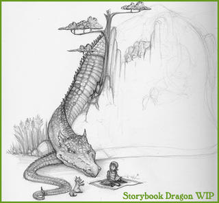
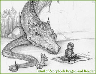
Here's the current state of my WIP "The Storybook Dragon". I've also included a detail image of the dragon's head and the Reader. As the days go by, I'll post some more progress shots of this and my other projects.


Strangely enough, my inspiration for the dragon is actually one of my rat snakes, Ghost. When I'm sitting here at the computer, especially in the warm afternoons, he likes to get himself in a comfortable spot in his tank and watch me.

Silly snake.