My Work in Progress

A sketchblog where I post a few of my scribbles from a variety of works-in-progress, usually from my rather random personal creativity outside of the daily grind. I occasionally, but not always, post the final artwork.

5/29/2007

Unmasked in progress


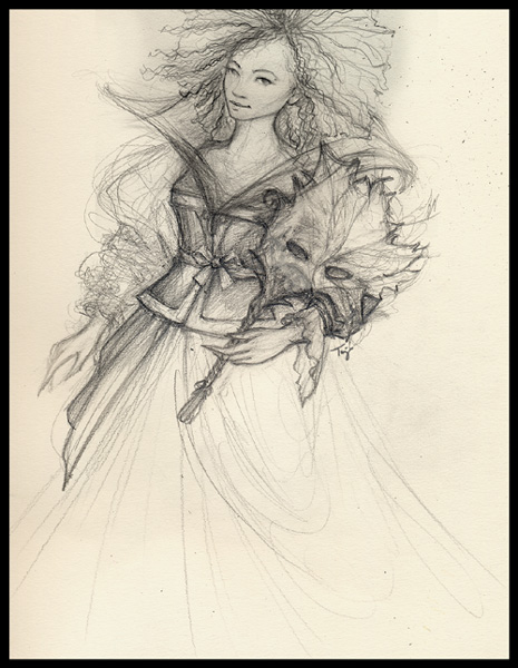
Here's the latest update to the dress sketch. I'm taking it slow, heh. Still have the background and secondary characters to sketch out. Over the weekend I checked out some different materials for the main character to figure out what fabrics will best give me the colors that I want to have in the final piece, too. When I started this illo, I decided to use a kind of visual story or metaphor of the character being revealed in the illustration (since it's also part of the relaunch of my website), hence the mask being moved over to the side. Not happy just yet with how I've sketched it, but it's a decent start. I probably will do a separate sketch of the mask on another sheet before I'm happy. Although it may actually all get painted over (digitally) when I'm working on the color final.

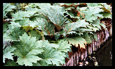
The final leaf design of the summer mask will be based on some rather large leaves by a river in a London park from a photo that I took when I was visiting London one summer. Here's one of the leaf photos I'm using as my reference. Believe it or not, the leaves are at least a foot if not 2 feet across. Those are ducks down below in the water.

I've already picked my palette (lots of lovely summer greens with secondary gold and brown colors and accents of some of my other favorites) which is definitely helping pull this illustration story out of my head onto my sketchpad. This one will be finished over the weekend, and I will post the final version when it's done. :)

Meant to add...I've been wanting to do an illustration like this for some time. One of the inspirations for it has been a long time favorite artist of mine, Adrienne Segur, from waaaay back when I was in 2nd grade, believe it or not. I was so enthralled by the Fairy Tales that she'd illustrated...that I checked out the book so much from the school library that I got in trouble. :( It was fun to find a bit more info about this artist this weekend as well as read an interesting article by some other favorite writers and artists of mine over at the Endicott Studios.

5/23/2007

Train of Thought

This rough sketch is part of the new homepage art that I'm working on for my updated portfolio. I'll be re-launching my website at last during the first week of June. Hurray! I think I finally have enough new pieces that I like, and all of that together with some previous projects fits in with the new creative career direction I've been steering myself for the past 5 years. Most of the art I'll be posting is recent work I've done in my free time or for freelance projects that aren't part of my toy design day job. So, rather than posting all of the wide variety of creative professional work that I've done over the years in my online portfolio (web, graphic design, illustration, branding, multimedia, software UI development, etc), I'm going for a more focused presentation that shows the type of work I'm most interested in pursuing currently and for future opportunities.

-----------------------------------------------------------

Over the weekend I decided that working with licensed art (well, let's say most licensed properties -- most recently I've been working with Disney styleguides for product design again so licensed art was on my mind a bit too much this past week) is like having to translate a foreign language.

I blame my random internal dialogue process for that bit of an odd revelation. :)

Just as with any language, with licensed art you have to understand the specific "grammer" or structure (since this is graphic design). Within that structure you have "words" or images which can be used in many different ways to create a "sentence" or product; however, because of the required structure of the particular styleguide (some licenses have quite a variety of styleguides, like the Disney Princesses, for example), you can only use these particular images, colors, fonts, patterns, borders, characters and backgrounds in certain ways that fit within the overall pre-defined license "message". That message can also change depending on who the target audience is, and how that audience probably feels the licensed characters should appear in whatever particular situation or story format the product design puts them in. It helps if you tend to buy the products developed for a particular license (yup, that's one of my excuses for some of the toys in my work area...ha) or at least do the research and find out what the various retailers are selling, who's buying the product, and how that product is being used. Is it for a little girl, or a little boy; or is it even gender specific? Is it for adults only, and not children? Is the product designed for interaction, to be played with; or is it supposed to be a collectible or display item only? What materials satisfies the design requirements of the styleguide, the purchase requirements of the consumer, and still fits the product line standards that I'm creating this toy for?

Yeah, all that thinking sometimes gives me a headache, too.

But, there's more!
And maybe I'll go into that another time. Just not today.

5/13/2007

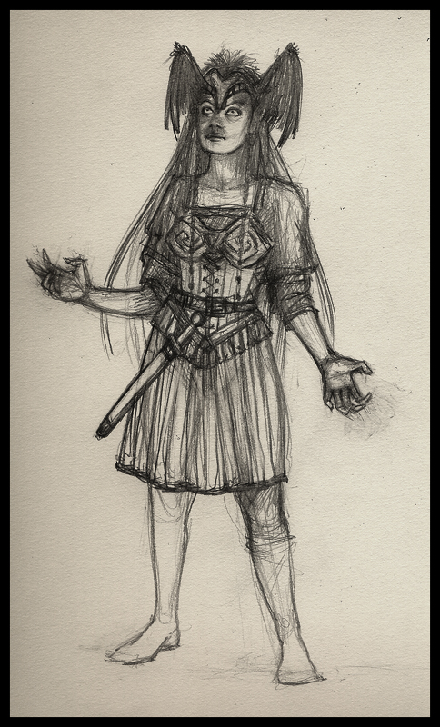
Valkyrie of the Damned


Another interesting CHOW topic over on CA that I just couldn't resist sketching up, the Fallen Valkyrie, although my character probably won't get finished till next weekend. I still want to do a close-up of her face with a nice "damned" expression, and put in the background and wolf steed/companion for the full figure that's rising up from Hel. And color it, of course! Unfortunately I was sick with something odd -- had fever and really bad chills Friday night into most of Saturday so I couldn't do all the artwork that I'd planned. Not good. Feel much better now, though, so back to work!

And I was reminded by another CA artist about my Fall Fairy sketch which they'd like to see in color...I'd like to do final tight lineart of it first, and then color. Especially since I just finished watching
Wendy Froud's DVD about creating a fairy figure art doll -- my Fall Fairy might be a good character to get that first practice with.


Hmm...

5/06/2007

And Death Came Riding By


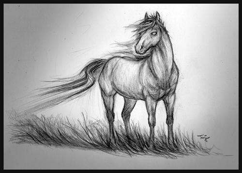
Opted to spend some of my relaxing sketchtime (i.e. nothing work-related) in the evenings this week on the previous CA.org
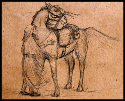
Character of the Week project, Death's Horse. Mine, however, isn't named Binky. The deadline (ha) was this past Sunday. The art I posted includes some of my early sketches. Since I still like to draw horses (remembering that old comfort drawings discussion...), it was an entirely enjoyable self-imposed sketch project to do.

While thinking about this subject, I found myself influenced by the aforementioned Binky, as well as the various horses that I owned or spent time with from jr high through college...long dead by this time (my first horse, Pride, in particular, such a lovely boyo -- horrible old picture of us both below); and the
Mari Llwyd. With just a dash of the Christian Apocalyptic Pale Horse.


Also recalled a nice little story about Mr. Death at the door in an old
Twilight Zone episode with a nice young Robert Redford. And what about that recent tv series Dead Like Me. They all had some quite different faces for Death. And without horses, too bad. With that, I then got to wondering about what I would see at death: would my doppelganger, my twin from the land of the dead, my mirror self, be the one coming to me as Death -- in my mind probably the only one I would trust to come fetch me when I was at last ready to die...whether fair, foul or something inbetween. Me, only me. :)

Then I read that long ago, when a new graveyard was built, a horse would be the first of any to be buried there. This horse would then become Death's horse.

And finally, I started thinking about
Death Jr.... Hmm.
And came up with that first sketch at the top. :)

In any case, the majority of wip sketches I've seen thus far from the artists posting seem to be focusing on a dark horse. Or could that be a creature from hell.... Difficult to tell with some of them. I don't think Death is something that everyone dreads...after all, there's supposed to be a heaven, too.

For a bit of whimsy, I wrote a quick sonnet ("Ode to Death's Horse" - ha!) to help me visualize my final character:

At dusk this noble creature waits for me,
Ever patient he bears my burdens well;
His bright eyes the light helping me to see,
His swift feet the way to heaven...or hell.


Always eager to take on every task,
No soul too heavy for his broad, strong back;
"Room for another?" is all I need ask,
And so, we go; fetching those we yet lack.


By the end of our ride his head still high,
We take the dark path to his resting place;
His stable the grave we reach with a sigh,
At dawn Death's horse a skeleton I face.


No better friend could I have at my side,
When I go out as Death on my night ride.