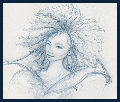
 This rough sketch is part of the new homepage art that I'm working on for my updated portfolio. I'll be re-launching my website at last during the first week of June. Hurray! I think I finally have enough new pieces that I like, and all of that together with some previous projects fits in with the new creative career direction I've been steering myself for the past 5 years. Most of the art I'll be posting is recent work I've done in my free time or for freelance projects that aren't part of my toy design day job. So, rather than posting all of the wide variety of creative professional work that I've done over the years in my online portfolio (web, graphic design, illustration, branding, multimedia, software UI development, etc), I'm going for a more focused presentation that shows the type of work I'm most interested in pursuing currently and for future opportunities.
 -----------------------------------------------------------
Over the weekend I decided that working with licensed art (well, let's say most licensed properties -- most recently I've been working with Disney styleguides for product design again so licensed art was on my mind a bit too much this past week) is like having to translate a foreign language.
I blame my random internal dialogue process for that bit of an odd revelation. :)
Just as with any language, with licensed art you have to understand the specific "grammer" or structure (since this is graphic design). Within that structure you have "words" or images which can be used in many different ways to create a "sentence" or product; however, because of the required structure of the particular styleguide (some licenses have quite a variety of styleguides, like the Disney Princesses, for example), you can only use these particular images, colors, fonts, patterns, borders, characters and backgrounds in certain ways that fit within the overall pre-defined license "message". That message can also change depending on who the target audience is, and how that audience probably feels the licensed characters should appear in whatever particular situation or story format the product design puts them in. It helps if you tend to buy the products developed for a particular license (yup, that's one of my excuses for some of the toys in my work area...ha) or at least do the research and find out what the various retailers are selling, who's buying the product, and how that product is being used. Is it for a little girl, or a little boy; or is it even gender specific? Is it for adults only, and not children? Is the product designed for interaction, to be played with; or is it supposed to be a collectible or display item only? What materials satisfies the design requirements of the styleguide, the purchase requirements of the consumer, and still fits the product line standards that I'm creating this toy for?
Yeah, all that thinking sometimes gives me a headache, too.
But, there's more!
And maybe I'll go into that another time. Just not today.

3 comments:
Nice sketch! And yikes about licensed art. I can't imagine how hard it must be to be creative with all those specifications.
You've got a blogger too? Neat! I'll add this to my Google Reader (a new obsession :P). I appreciate your comments. Wow, I've not yet tried illustrating for any licensed properties. Sounds like a major headache! I'm looking forward to seeing your new site design.
Thanks, ladies! :) Getting feedback from the license artists who work specifically with the particular licenses or their styleguides (like Disney, for example) does help sometimes. Especially, when it's a product design for a character I'm not really familiar with (heh, or don't like...eh, but I don't always have the option to pass those on to the other artists on my team).
Post a Comment